Search found 1960 matches
- Sat Oct 22, 2011 4:16 pm
- Forum: Post Visual Art
- Topic: Lightly stylised water-colour (take 2)
- Replies: 3
- Views: 1517
Lightly stylised water-colour (take 2)
This is a completely fresh attempt at the piece I posted last week. I have used an alternative approach in respect of the areas highlighted in previous comments and I have changed it in a few other ways to take account of my own observations having had time to reflect. I also shifted the tonality of...
- Sat Oct 22, 2011 4:05 pm
- Forum: Post Visual Art
- Topic: Llyn Idwal
- Replies: 5
- Views: 1593
Re: Llyn Idwal
It is a striking piece, the colour placements are adding a good amount of vibrancy due to the use of primary and secondary colours. The waterline might work better if dealt with as a flat body with some incremental detailing to portray the diminishing perspective. Obviously a lot of observations in ...
- Sat Oct 22, 2011 3:46 pm
- Forum: Post Visual Art
- Topic: Rafters
- Replies: 8
- Views: 2898
Re: Rafters
I like this John, i takes the reflections to the next level in comparison to the other pictures containing this subject. Perhaps you might enjoy adding to the composition in the reflections and taking some control over arranging additional objects to be discovered. There is immense scope in respect ...
- Sat Oct 22, 2011 3:36 pm
- Forum: Post Visual Art
- Topic: Lightly stylised water-colour
- Replies: 5
- Views: 1304
Re: Lightly stylised water-colour
Thanks Mic, I do have a purpose for the picture and I have painted it again, thanks for your input. John, many thanks, colour and light are my priorities in much of what I do when creating a picture. I agree the sea is not quite right, to be honest I changed my mind about the composition after start...
- Sat Oct 22, 2011 3:27 pm
- Forum: Post Visual Art
- Topic: 3 more from the experimental stable
- Replies: 5
- Views: 1507
Re: 3 more from the experimental stable
The middle one is the one I enjoyed viewing most as there is a suggestiveness in respect of the unseen hands, almost having three nipples seems a little odd, but suspect that is simply down to an adjustment of its placement. The abstraction is working well in the top picture and I think you could ha...
- Mon Oct 17, 2011 4:25 pm
- Forum: Post Visual Art
- Topic: Lightly stylised water-colour
- Replies: 5
- Views: 1304
Re: Lightly stylised water-colour
Thanks Delph_ambi, strangely enough the actual picture sat on my mantle-piece, still taped to my trusty board doesn't make the subject seem quite as precarious, but it's a valid observation and I'm pleased that other aspects of the picture have come across well, as I have not done any water colour w...
- Sat Oct 15, 2011 6:45 pm
- Forum: Post Visual Art
- Topic: Lightly stylised water-colour
- Replies: 5
- Views: 1304
Lightly stylised water-colour
Yes the picture is on the piss because my taping was a bit rushed :D It has to be trimmed out, once I am sure I am not going to wet the paper again. It's on A4 425gsm which makes everything too damn fiddly but hey ho lol. Best viewed from a few feet. http://i1084.photobucket.com/albums/j402/AWDX4/Wa...
- Sat Oct 15, 2011 6:32 pm
- Forum: Post Visual Art
- Topic: red backed shrike
- Replies: 6
- Views: 1335
Re: red backed shrike
I love the colour accuracy, though I'm sure you are already aware that it is very flat which can be a pit-fall with this medium, especially if you are working from an image which is a little dead in respect of light on the plumage. I think some shadow beneath the foot would improve the perception of...
- Sat Oct 15, 2011 6:21 pm
- Forum: Post Visual Art
- Topic: Proportions
- Replies: 5
- Views: 1300
Re: Proportions
Mic, I like the posture that you have captured in the drawings and I find something which appeals in each. Definitely a huge stop in the right direction in respect of symmetry with no massively disproportionate limbs to hamper the overall impression. I agree with Delph_ambi, the lower legs seem espe...
- Sat Oct 15, 2011 6:12 pm
- Forum: Post Visual Art
- Topic: Portrait (water colour)
- Replies: 3
- Views: 965
Re: Portrait (water colour)
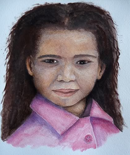
Apologies for my late acknowledgement in respect of replies, I've been working away and have had to put everything else on the back boiler. Thank you John, the stiff fabric is a pink mac which is why it's a little on the stiff side. I'll ponder the lips as they vary tremendously depending upon ethni...
- Thu Oct 06, 2011 6:36 pm
- Forum: Post Visual Art
- Topic: Portrait (water colour)
- Replies: 3
- Views: 965
Portrait (water colour)
60 min water colour on A4 425gsm pre soaked and stretched water colour paper.
- Thu Oct 06, 2011 6:27 pm
- Forum: Post Visual Art
- Topic: Dam Head, Bishop Auckland
- Replies: 8
- Views: 2588
Re: Dam Head, Bishop Auckland
Delph_ambi, I've learned to look at this kind of work you post from natural viewing distance like I would if it hung on a wall. The light in the water makes very pleasant viewing and you appear to have employed some spirit level detailing in some areas where is meets a solid surface, I think you cou...
- Thu Oct 06, 2011 6:07 pm
- Forum: Post Visual Art
- Topic: Still Life Studies Vol 1
- Replies: 1
- Views: 854
Re: Still Life Studies Vol 1
John, aside from the obvious content and your choice of different lighting conditions I found myself spending a fair bit of time exploring the reflections, especially in the fist picture, to try and identify other objects in the room. There is something in each image for the viewer to engage with by...
- Thu Oct 06, 2011 5:24 pm
- Forum: Post Visual Art
- Topic: Fencing (Colour pencil sketch)
- Replies: 4
- Views: 6088
Re: Fencing (Colour pencil sketch)
John, thanks for taking time to reply and offer your thoughts. Yes there were a number of vibrant green leaves in the photo I used and it served my purpose to use them as a means of getting some blue by way of it being a component of the green to bounce off the reds and oranges. The actual picture i...
- Thu Oct 06, 2011 10:13 am
- Forum: Post Visual Art
- Topic: Bark
- Replies: 7
- Views: 1754
Re: Bark
Impressive set of pictures Marten, the high colour saturation really stands out in the second image. The textures are really good and each picture has its own individual qualities to be enjoyed.
all the best
Danté
all the best
Danté
- Thu Oct 06, 2011 10:09 am
- Forum: Post Visual Art
- Topic: Arms
- Replies: 5
- Views: 1429
Re: Arms
John, this works really well. The subject has aspects of the picture content which could allude to a variety of places the mind might wander, and the colours are working together to enhance the vibrancy of each. The wood and skin combination is very pleasing to the eye with the overall contrast in r...
- Mon Oct 03, 2011 4:48 pm
- Forum: Post Visual Art
- Topic: Fencing (Colour pencil sketch)
- Replies: 4
- Views: 6088
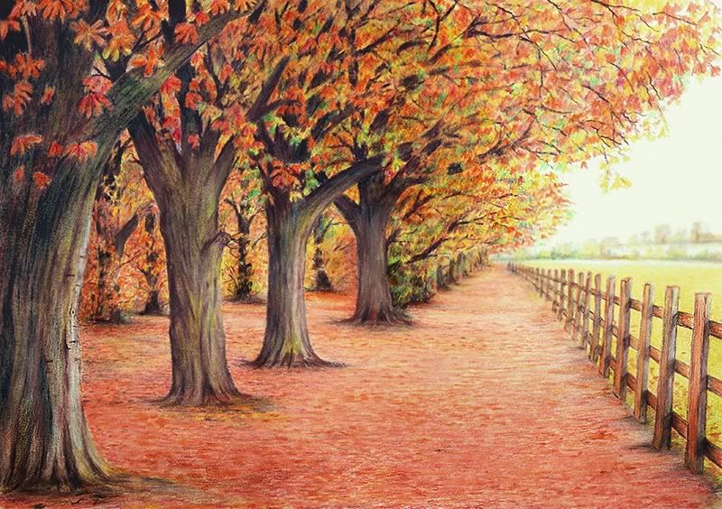
Fencing (Colour pencil sketch)
Mixed Derwent drawing and Derwent academy pencil sets on A4 220gsm paper, small amount of white pastel crayon, rubbed in to achieve slight blurring effect.
- Mon Oct 03, 2011 4:34 pm
- Forum: Post Visual Art
- Topic: Woodland pencil sketch
- Replies: 5
- Views: 2749
Re: Woodland pencil sketch
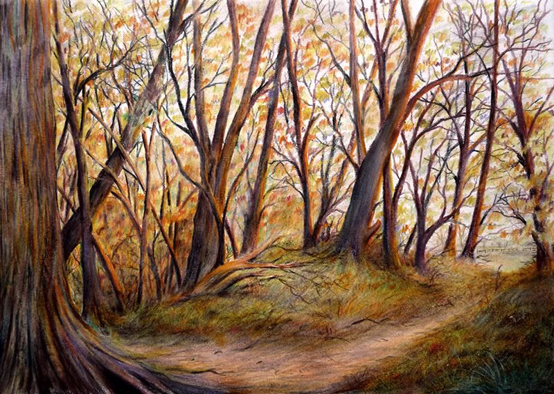
Delph_ambi, Many thanks for the reply and for taking a look at the drawing. I get what you are saying about the resolution of the trees as they become more distant. I didn’t fret over it when drawing as the picture is meant to be viewed from a short distance so I kept things fairly simple like with ...
- Fri Sep 30, 2011 5:35 pm
- Forum: Post Visual Art
- Topic: Bathroom on the Lake
- Replies: 5
- Views: 1345
Re: Bathroom on the Lake
The thing that stood out to me with this picture is the no bullshit functionality of the items contained in the image. The image delivers the subject in a tangible way which I personally though to transcend the manner of its execution. That said the tonal choice does work well with the textures and ...
- Fri Sep 30, 2011 5:29 pm
- Forum: Post Visual Art
- Topic: Autumn
- Replies: 4
- Views: 1004
Re: Autumn
Delph_ambi, this comes across strongly with the line and colour technique although I'm not convinced the limited palette you used contained the absolute best base colours for the subject. The shadows washed into the secondary colour has robbed the picture of some of the available vibrancy at your di...
- Fri Sep 30, 2011 5:09 pm
- Forum: Post Visual Art
- Topic: Three experimental life drawings
- Replies: 5
- Views: 1515
Re: Three experimental life drawings
Mic, The top and bottom drawings allow a lot of positive interpretation which kind of negates the proportion issues, the forms have presence regardless of the minimalist presentation in respect of working the light which you could have done to counter the form anomalies. The abstract is impressive a...
- Sun Sep 25, 2011 10:57 am
- Forum: Post Visual Art
- Topic: Woodland pencil sketch
- Replies: 5
- Views: 2749
Woodland pencil sketch
A colour pencil sketch on A4 220gsm off white paper photographed in natural light, unedited aside from sizing for posting.
- Sun Sep 25, 2011 10:44 am
- Forum: Post Visual Art
- Topic: Eilean Donan Castle
- Replies: 7
- Views: 1238
Re: Eilean Donan Castle
Delph_ambi, I appreciate what you say about the fat pastels and to be fair, as a piece of art it's certainly a picture which would look great in a frame and would be appreciated for its qualities. As you point out, I've had similar obstacles to work around doing small pictures with chunky pencils an...
- Sun Sep 25, 2011 10:24 am
- Forum: Post Visual Art
- Topic: Stag Beetle
- Replies: 5
- Views: 1218
Re: Stag Beetle
John, yes the antennae are a bit OTT lol, I had a couple of objectives with this piece. Firstly I wanted to get used to some fairly chunky pencils which are very limited in their colour range and I also wanted to make the picture artistic rather than it appear like an old encyclopedia plate which I ...
- Thu Sep 22, 2011 5:32 pm
- Forum: Post Visual Art
- Topic: Eilean Donan Castle
- Replies: 7
- Views: 1238
Re: Eilean Donan Castle
Delph_ambi, I like this for its light and sense of distance. The colours are to my eye working well. The areas I think could work better are areas of colour shading in/on the water roughly quarter way up from the bottom of the picture, I think they might appear more convincing if the movement when a...