Page 1 of 1
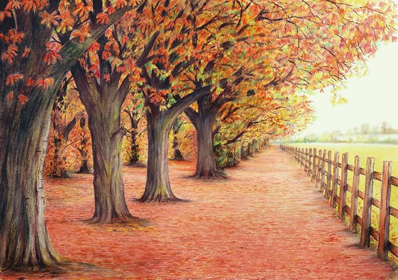
Fencing (Colour pencil sketch)
Posted: Mon Oct 03, 2011 4:48 pm
by Danté
Mixed Derwent drawing and Derwent academy pencil sets on A4 220gsm paper, small amount of white pastel crayon, rubbed in to achieve slight blurring effect.
Re: Fencing (Colour pencil sketch)
Posted: Mon Oct 03, 2011 6:29 pm
by JohnLott
Not bad Dante
Delicate autumnal woodland tones (with some vibrant green leaves?). Maybe too pinkish overall - especially if they're Maple.
Not sure the shadow/depth of wood of the fence is right.
If you aren't going down the symbolism route, I would prefer more detailing - at the moment it's a little generic with little 'character'.

J.
Re: Fencing (Colour pencil sketch)
Posted: Mon Oct 03, 2011 9:01 pm
by delph_ambi
Nice one. I'm assuming these are sycamores from the colour and leaf shapes. Good recession and perspective. I particularly like the partially hidden trees on the left. Has a slight 'over-exposed' look, especially top right, but that's probably the fault of my monitor.
Re: Fencing (Colour pencil sketch)
Posted: Tue Oct 04, 2011 5:23 pm
by marten
This is really very good. I like the slightly out of focus background. It adds depth and dimension to the drawing. The ground could use a little more leaf detail though. I know you're working with color these days but I'd love to see you tackle a landscape in monochrome. You've got talent sir!
Marten
Re: Fencing (Colour pencil sketch)
Posted: Thu Oct 06, 2011 5:24 pm
by Danté
John, thanks for taking time to reply and offer your thoughts. Yes there were a number of vibrant green leaves in the photo I used and it served my purpose to use them as a means of getting some blue by way of it being a component of the green to bounce off the reds and oranges. The actual picture is a bit less pink to be fair, I think the scanner has a slight aversion in respect of deeper orange and some blues. I could have altered the hue but that would have thrown everything else out of the window lol. The fencing shadows are pretty close to the original photo, shadow wise which was probably due to the abundance of orange light being thrown in all directions by the leaves and the diffusion effect of the slightly hazy sky condition giving an overall lack of well defined shadow beyond that which existed on the fence planking. Most likely due to them being impermeable to the light source whereas the foliage of the trees allowed a reasonable amount of backwash through the leaves to occur. I take on board what you say about the lack of character and yes I guess trees, fields and sky are quite generic subject matter which did serve my purpose in exploring the medium in which is my fifth piece having never tried to seriously work with colour pencils.
Delph_ambi, thanks once again for your input. I think the over exposed effect is the unnatural light of the scanner washing out the subtle hues at low resolution as it’s just there on the actual piece. I’m reasonably pleased with overall effect and I’m sure you can appreciate the amount of pencil strokes it takes to get the textures anywhere near to being able to deliver a sense of their structure.
Marten, I’ll have a go with monochrome in the near future with this kind of subject. Yes I could have tucked a few more details in where the leaves are on the ground which might have also added character, to be honest I’d pretty much blown my enthusiasm after drawing the leaves and probably should have had one more session on the picture before deciding it was finished. I find it too easy to over work a piece so maybe my caution needs a slight adjustment.
Many thanks
Danté