Lightly stylised water-colour (take 3)

Where poets, painters, photographers and other artists can mingle.
Post Reply
User avatar
Danté
Perspicacious Poster
Posts: 2017
Joined: Mon Jul 07, 2008 6:40 pm
Location: nothere

Sat Nov 05, 2011 11:54 am

I intended to get straight on with another attempt at this, but work commitments have kept me away from creativity for a week or so. Anyway, I moved further below the high water line and altered the perspective and time of day in this attempt. I'm going to use this one as I am not really keen on painting the same thing over too many times. I learned a lot from doing the repeats in respect of adding a figure to a landscape which is new to me. It's a real sod, painting a face not much bigger than my my thumb nail in water colour, but I feel I got a lot out of the repetition of this subject. I've posted two sizes as the in one's face big image tends to show the method and not the effect and I can see from other works posted about the place, it is not too easy to present every picture so it can be viewed in the correct way.

Image

Image
to anticipate touching what is unseen seems far more interesting than seeing what the hand can not touch
delph_ambi
Preponderant Poster
Preponderant Poster
Posts: 857
Joined: Wed Aug 18, 2010 1:33 pm
Location: November
Contact:

Sat Nov 05, 2011 3:30 pm

This demonstrates perfectly the problems of posting. In the smaller pic, the water looks wet and ripply and entirely real. In the larger pic, it loses something. The foreground looks great, but the waves in the background don't work -- but they do in the small pic, yet it's the same pic. The reflected trees are particularly effective.

It's a completely captivating painting, regardless of any of the above.
JohnLott
Preponderant Poster
Preponderant Poster
Posts: 1326
Joined: Tue Feb 22, 2011 9:35 pm
Location: Devon

Sat Nov 05, 2011 4:33 pm

Captivating is right.
A really good study in colours and lines.
The bigger version is great if I go back about 8ft. It keeps the contrasts related to the lines while balancing the colour.
:D

J.
Before you shave with Occam’s razor - Try epilation or microlaser
gavin
Prolific Poster
Prolific Poster
Posts: 501
Joined: Sun Apr 04, 2010 4:03 am

Sun Nov 06, 2011 3:50 am

fuck----

change her face---its the face of a woman who hit me over my head with my own dick--

get rid of her hands they look like her hands that could pick up railway lines and hit you over the head;

but keep going; keep doing the same drawing i find it wonderful.

have a look at the shadow of the trees, then have a look at her shadow, up skit creek;

if the shadow is midday it would be on shore the trees that is ; her shadow is all wrong with midday;

and fucking delph is right about the ripples. but keep going; that what i do;

it a child in the shallows not my dick,

give her face a smokey childish feeling, elonggate her fingers;
k-j
Perspicacious Poster
Posts: 3004
Joined: Thu Aug 04, 2005 10:37 pm
Location: Denver, CO

Sun Nov 06, 2011 6:52 am

Looks like the girl has been photoshopped onto the landscape. She seems to be extending an arm in greeting, but the rest of her denies this. No friendliness in face or posture. So she's sort of like the person you might see in a nightmare, but not in real life. And the background - the sea etc - seems completely irrelevant - i.e., she seems unaware of it and it of her. I'd keep the sea and get rid of the she.
fine words butter no parsnips
User avatar
Danté
Perspicacious Poster
Posts: 2017
Joined: Mon Jul 07, 2008 6:40 pm
Location: nothere

Sun Nov 06, 2011 10:28 am

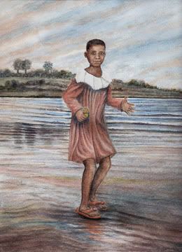
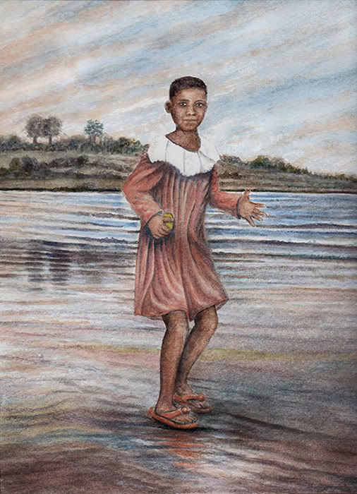
Delph_ambi, thanks for your reply, your input in respect of the earlier versions along with John’s observations helped me see things which one tends to gloss over when trying to be self critical. It’s not perfect but it looks quite striking in the flesh and I’m pleased with the overall impression. Thanks again.

John, thanks for taking time to reply. I very much enjoy using the effects of colour placements and I am glad the way I’ve used them comes across to some viewers. I learn something every time I paint a picture and the replies I get here help me question aspects of what I produce that I could easily overlook. It’s not always easy to find the balance between style and the conviction to work with it, when it’s not to everyone’s personal taste. My poetry tends to draw a range of reactions so at least I have consistency across different forms of expression lol. Much appreciated.


Gavin, you’ve raised a few interesting points though your observations. Why might a person have “hands that could pick up railway lines and hit you over the head”. Have you ever been to the country/region in Africa where I took my original photos, which I use to reference physical traits? I have hands like shovels and I have long fingers, the wife has bigger hands than me but short fingers and she probably could pick up a railway line and hit you over the head whilst smiling at your tiny dick, the picture is not of her but she grew up in that area, where hard graft starts at an early age.

I am very keen to see your own art work which I seem to recall you loosely threatened to post, I read on another thread nearby. A clever chap like you should have no trouble finding a way to capture images and upload them to this forum.

As always the wisdom of your words gives one much to take on board through the enlightening nature of the conclusions you reach and the logic upon which those conclusions appear to be constructed, thank you.


k-j, thanks for the feedback, I hadn’t intended to have the picture come across as being photographic, the point in respect of facial expression is one which pleases me. I could have easily painted a smile and although I don’t pretend to be a brilliant portrait painter I do think I could have managed that. Why might there be this contradiction? What might the girl be seeing which prompts that variation in body language? The picture is by no means perfect but the overall effect works a lot better when not simply coloured by the spectrum of light produced by the limited source contained within my scanner. I kind of bluffed the faces in the previous versions of this picture but having gained a little more confidence through the exercise of repeated painting, I decided to paint this one in a more controlled manner.

I can assure you that a pale, white man like me wandering around areas where there is no electricity or TV, where people have never actually seen a white person in the flesh does generate a wide variation of reactions and a lot of trepidation. There is always something to improve upon as one paints subsequent pictures and the subjective nature of visual art does divide opinion in a useful way. I appreciate your input and I’ll bear it in mind if you happen to commission my services at a future time.

All the best

Danté
to anticipate touching what is unseen seems far more interesting than seeing what the hand can not touch
User avatar
marten
Preponderant Poster
Preponderant Poster
Posts: 1019
Joined: Wed Nov 22, 2006 7:00 am
antispam: no
Location: Seattle

Mon Nov 07, 2011 9:46 pm

This is good; however, I like the color, contrast and depth of the first one. The drawing and position of the girl is better, but the image on a whole, is much less dynamic than your first rendering. There is too much matching of pinkish-brown color tones in the sky, water and dress that make everything seem rather flat. I think it could benefit from some more blue/cyan saturation to add a bit more vibrance. You may want to bring in some more shadow to make the image pop. If she is stepping on the water the ripples should be moving away from her, these appear to be passing through her undisturbed. The potential is there.

M
Well you know you can't spend what you ain't got,
you can't lose some blues you ain't never had
-Muddy Waters
User avatar
Danté
Perspicacious Poster
Posts: 2017
Joined: Mon Jul 07, 2008 6:40 pm
Location: nothere

Sat Nov 12, 2011 12:03 pm

Thanks Marten, you raise some good points. It's an experimental picture and I'm probably not representing some elements in a way which comes across as I hoped. The actual picture is more vibrant at the blue end of the spectrum which makes the rippled area around the feet come across more like the intended wet rippled sand which one often finds where the tide runs along the sand flats. I'm trying to broaden my style a little and finding different techniques to represent textures and it will probably take a fair bit of practice to get a more universally acceptable representation of some things I want to paint. I kind of chop and change between photographing stuff to post and scanning as it's really frustrating trying to get an accurate image which doesn't rob the pictures of some aspect of colour temperature. I could tweak them with a photo editor but that would taint the actuality of the post and I don't feel comfortable posting work that is supposed to be what I have created by hand and having it manipulated on the PC. No doubt I'll paint similar material going forwards and improve upon what I attempted here. I'm wondering if I should have painted this subject straight instead of working in a styled manner. It's a bit of a dilemma because I don't see a lot of point in simply copying in a photographic manner because the camera is so much easier. To me the picture should embody observation, interpretation by the artist and through the subsequent output, certain aspects are altered to reflect an artist's own creative agenda.

Thanks Marten, for your useful input.

all the best

Danté
to anticipate touching what is unseen seems far more interesting than seeing what the hand can not touch
Post Reply